
Dayspring is a celebration of renewal — not only of season, but of spirit.
This collection gathers a series of intricate mandala-inspired designs that explore rhythm, symmetry, and the quiet power of repetition. Each piece begins at a central point and unfolds outward in measured layers, revealing shifting moods through color, contrast, and form. Some compositions glow with warmth and bold saturation; others rest in softened earth tones or cool, reflective palettes. Together, they create a spectrum of feeling — from exuberant and kinetic to contemplative and serene.
Throughout Dayspring, recurring motifs echo like refrains in music: petal forms, teardrops, rounded squares, scalloped rings. Yet no two designs move in quite the same way. Some pulse with high energy and vivid contrast. Others hum with subtle intricacy, inviting a closer look. The geometry is precise, but the overall effect remains organic — as if each pattern has grown rather than been constructed.
At its heart, Dayspring is about emergence. About light returning. About color rising gently — or boldly — into view. It is a gallery of balance and motion, where structure and softness meet, and where every design carries its own quiet awakening.
A Hug from My Baby Boy

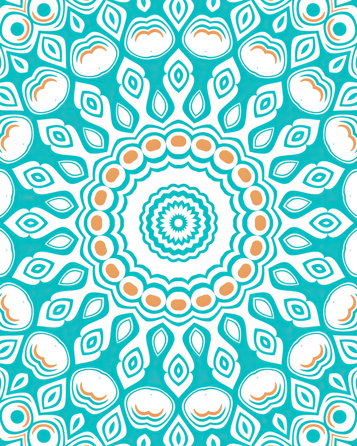
A quiet symmetry unfolds in this mandala, where soft celestial teal petals radiate outward like pressed leaves resting between the pages of an old botanical journal. Gentle rings of sage and cream circle the center, each layer balanced with careful intention, as though sketched in ink beneath steady candlelight. Hints of coral bloom at the heart and along the outer edges, adding a subtle spark — like wax seals pressed onto parchment.
The design feels both grounded and luminous, intricate yet breathable. Its repeating forms create a calming rhythm, inviting the eye to wander inward and outward again. Refined and harmonious, this piece carries a modern clarity while still echoing vintage ornamentation — a printable meditation of color, pattern, and quiet wonder.


A Kiss on the Cheek of My Baby Girl

This mandala opens like a pressed bloom at midsummer — layers of olive green unfolding against a field of soft cream, edged in rose that feels gently sun-warmed rather than sweet. The center glows with fine, radiating lines, precise and almost architectural, while the surrounding forms soften into petal-like shapes that repeat with steady grace. There is something quietly celebratory in the rhythm, as though patterned after old tiled courtyards and garden mosaics.
The palette carries both freshness and depth: mossy greens grounded and botanical, dusky rose lending warmth without excess. Each ring feels deliberate, measured, and beautifully contained. It’s a design that balances bold symmetry with floral softness — a printable ornament that feels equally at home in a modern space or tucked among vintage textures and linen-bound books.


Adoria

This mandala blooms in vibrant rose, its petals unfolding in confident layers against a pale, airy ground. Olive green accents thread through the design like pressed leaves tucked between handwritten letters, grounding the brightness with a quiet earthiness. The center forms a delicate starburst, crisp and intentional, while surrounding teardrop shapes create a sense of movement that feels lively yet beautifully controlled.
There is a playful boldness in this palette — the pink bright and joyful, the green steady and botanical — yet the symmetry keeps everything refined. Each ring feels carefully placed, echoing vintage textile patterns and ornamental tilework. The result is a design that feels fresh but timeless, decorative yet composed, like a modern heirloom printed with care and a touch of summer warmth.


Alien Angels

This mandala feels like an heirloom unearthed from a cedar chest — warm, intricate, and quietly luminous. Layers of parchment cream are traced with burnished gold and deep brick red, forming a pattern that feels both ornamental and architectural. Soft olive accents settle between the shapes like aged leaves pressed into the margins of an old field journal. The center gathers into a finely detailed rosette, delicate yet grounded, as if inked with steady hands under lamplight.
There is a richness here without heaviness. Each repeating motif carries a gentle vintage character, reminiscent of tiled courtyards, embroidered linens, and timeworn mosaics. The palette leans earthy and composed, allowing the symmetry to feel stately rather than ornate. It’s a printable design that radiates warmth and craftsmanship — balanced, storied, and quietly enduring.


Amberly

This mandala carries the warmth of late afternoon sun filtered through patterned glass — radiant without harshness, structured yet glowing. Layers of golden ochre and honeyed yellow ripple outward from a detailed center, while soft taupe and warm gray create gentle contrast that keeps the brightness grounded. The repeating motifs feel almost enamelled, as if set into a tiled surface where geometry and ornament meet with quiet precision.
There’s a buoyant clarity to this palette. The interplay of rounded forms and petal-like shapes creates a sense of cohesion that feels both playful and composed. It leans slightly retro in spirit — reminiscent of mid-century textiles and sunlit ceramic work — yet remains timeless in its symmetry. A printable design that brings warmth, optimism, and thoughtful structure to any space it inhabits.


Awakening the Spring

This mandala feels like a celebration caught mid-bloom — bright, spirited, and joyfully precise. Electric blue arcs sweep around the outer rings, meeting vibrant pink and fresh green in crisp, repeating forms. Golden yellow accents flicker through the center like small bursts of sunlight, giving the composition a luminous heartbeat. The shapes are clean and graphic, almost lacquered in their clarity, creating a design that feels both playful and meticulously arranged.
There’s an unmistakable energy here, reminiscent of festive tilework and bold contemporary textiles. The symmetry holds everything in perfect balance while the color palette keeps it lively and modern. It’s a piece that radiates optimism — structured, radiant, and full of movement — a printable design that brings color and confident rhythm into any thoughtfully curated space.


Beyond Time

This mandala carries a striking contrast — bold charcoal forms set against soft blush and warm ivory, punctuated by rings of golden amber. The composition feels architectural, almost carved, with dark geometric shapes anchoring the outer edges while petal-like motifs gather toward the center in careful succession. Each layer builds upon the last with crisp definition, creating a sense of depth without heaviness.
The palette balances drama and warmth beautifully. Inky black shapes lend strength and structure, while the muted pink softens the geometry, allowing the gold tones to glow rather than overpower. There is a refined tension here — graphic yet graceful, grounded yet luminous — as though symmetry itself has been tailored with intention and restraint.


Bounty of Amorous Bliss

This mandala unfolds in layered shades of rose — from soft blush to vivid crimson — creating a composition that feels lush, rhythmic, and unmistakably expressive. Rounded motifs echo outward in steady succession, each ring deepening in tone and intensity. The center radiates like a stylized bloom, its petal forms elongated and fluid, while surrounding shapes form gentle ripples that feel almost velvety in their repetition.
There is a confident sweetness to this palette, but it never slips into excess. The interplay of pink and red creates depth rather than flat brightness, giving the symmetry a sense of pulse and presence. It carries a romantic boldness, graphic yet graceful, where repetition becomes a kind of visual refrain — harmonious, saturated, and beautifully assured.


Celebration of Generations

This mandala carries a grounded vitality, where deep evergreen at the center anchors the composition like a steady pulse. From that rich core, soft sage lines extend outward in graceful arcs, framing warm bursts of tangerine that feel spirited and alive. The interplay of rounded shapes and elongated petals creates a layered rhythm — structured, yet relaxed — as if geometry itself has softened at the edges.
The palette feels both earthy and celebratory. Muted greens bring calm and continuity, while the orange notes introduce warmth and brightness without overwhelming the design. Subtle caramel tones along the outer rings add depth, giving the symmetry a sense of dimension and quiet cohesion. The overall effect is balanced and confident — a meeting of botanical freshness and mid-century clarity, rendered with thoughtful precision.


Crane Flower Jig

This mandala feels sun-washed and buoyant, as though shaped by warm coastal air and patterned tiles. Soft turquoise and sea-glass teal weave through layers of apricot and citrus orange, all resting against a mellow cream backdrop. The center forms a compact floral burst, surrounded by rounded motifs and gentle scallops that create an easy, flowing cadence rather than sharp precision.
There is a retro brightness to the palette, reminiscent of mid-century ceramics and painted courtyard walls, yet the symmetry keeps it poised and intentional. The interplay between cool teal and warm orange creates a lively tension — fresh, optimistic, and full of motion. Every ring builds outward with confident repetition, giving the composition a spirited clarity that feels both nostalgic and newly awakened.


Dance of Spring

This mandala feels exuberant and alive, layered in vivid greens, punchy coral-orange, and flashes of magenta that seem to hum against the crisp white ground. Leaf-shaped motifs radiate from the center in bright succession, each ring shifting slightly in scale and color, creating a dynamic sense of expansion. The interplay between saturated green and electric pink gives the composition a contemporary boldness, while the symmetry keeps it disciplined and beautifully ordered.
There is a festive brightness here, almost celebratory in its color contrasts. The alternating shapes — rounded forms, pointed petals, and softly squared frames — create a lively cadence that feels rhythmic and animated. It’s a design that balances joy with structure, where vibrant hues are held in careful alignment, resulting in a composition that feels energetic, fresh, and confidently expressive.


Dance of the Garden Gnomes

This mandala carries a warm, confectionary richness — layers of cocoa brown, creamy ivory, and soft caramel unfolding around a heart of rose. The central ring feels almost embroidered, with petal-like shapes nestled closely together, while outward layers introduce gentle starbursts and rounded motifs that alternate between strength and softness. The darker outer edges frame the composition with depth, giving the lighter interior room to breathe.
There is a comforting harmony in this palette. Chocolate tones ground the design, blush accents add a quiet glow, and muted beige keeps the symmetry feeling smooth rather than sharp. The repetition feels steady and assured, like a patterned tapestry woven with patience and care — balanced, inviting, and quietly intricate.


Dayspring Memory

This mandala carries a cool serenity, unfolding in layered shades of turquoise and violet against a soft, pale ground. The central rosette is encircled by elongated petal forms in deep plum, their curves echoed in lighter aqua rings that create a gentle, undulating cadence. Small clusters of violet dots drift between the bands, adding a subtle punctuation that keeps the symmetry feeling lively rather than rigid.
The palette feels crisp and luminous — aquatic blues meeting rich purple with a flash of citron tracing the outer edge. Rounded scallops and concentric circles give the composition a smooth continuity, almost like glazed ceramic cooled to a satin finish. There is clarity here, a composed radiance where color and repetition settle into balance with quiet confidence.


Dream Vividly

This mandala unfolds in hushed, silvery tones — a constellation of soft lilac, muted sage, and gentle blush arranged in meticulous concentric rings. The repeating oval and rounded-square motifs create a mosaic-like surface, each shape outlined with delicate contrast that gives the pattern a subtle dimensional lift. The center remains airy and refined, a pale rosette that anchors the design without demanding attention.
There is a dreamlike quietness to this palette. Cool grays and lavender notes drift outward in steady repetition, forming a visual texture that feels almost architectural in its precision. The symmetry is intricate yet restrained, allowing the softer colors to speak in whispers rather than declarations. The overall effect is contemplative and composed — layered, rhythmic, and elegantly subdued.


Exotic Groove

This mandala carries a bold nocturnal richness, set against a saturated field of royal violet that immediately commands attention. Concentric rings of ivory and luminous yellow form a striking contrast, each circle cleanly defined and rhythmically spaced. The center blooms in layered petals of deep plum and soft white, radiating outward with crisp precision, while rounded motifs along the outer bands create a steady, almost percussive cadence.
The palette feels dramatic yet refined — golden accents glowing against the purple ground, white shapes providing clarity and lift. There is a confident symmetry here, graphic and self-assured, where repetition becomes a visual pulse. The interplay of light and dark gives the composition depth and presence, resulting in a design that feels vibrant, structured, and unmistakably expressive.


Groovy Alien Ritual

This mandala settles into a lush spectrum of green — from soft chartreuse to deep olive — creating a composition that feels immersive and organic. The layered petals and rounded forms interlock with steady precision, each ring slightly darker or lighter than the last, giving the design a subtle dimensional swell. The center forms a compact floral star, while outward bands alternate between circular and leaf-like motifs, establishing a measured, almost hypnotic rhythm.
There is a grounded richness to this monochromatic palette. Without contrasting hues to distract, the structure becomes the quiet focus — repetition, spacing, and proportion carrying the visual weight. The overall effect feels earthy yet graphic, like pigment layered carefully upon pigment, resulting in a design that is cohesive, enveloping, and deeply rooted in tone and symmetry.

Gypsy Twirl

A burst of coral red gathers at the center, edged by a flicker of turquoise that cools the intensity just enough to let it breathe. From that vivid core, petal-like forms ripple outward in alternating bands — some rounded and soft, others shaped like small hearts caught mid-spin. The repetition feels lively rather than rigid, as if the pattern were turning gently in place.
Turquoise arcs weave between the warmer tones, creating a bright dialogue of cool and warm that keeps the composition buoyant. The symmetry is crisp, almost graphic, yet the softened edges give it a playful ease. There’s a sense of motion here — a contained whirl of color and shape — where red and blue-green meet in confident, joyful contrast.


Her Favorite Memory

Intricacy gathers immediately here — plum and olive interlacing in tight succession, each small motif echoing the next with almost mosaic-like density. Rounded squares, teardrops, and soft diamond shapes cluster in layered rings, creating a surface that feels richly tessellated rather than airy. The center remains finely detailed, a compact floral star surrounded by carefully nested forms that build outward with patient repetition.
The palette leans earthy yet refined. Muted green offers steadiness while deep purple adds contrast and quiet depth, both softened by a pale, creamy ground. There’s a gentle vintage character in the color pairing, but the precision of the geometry keeps it contemporary. The effect is intricate without feeling ornate — patterned, measured, and thoughtfully composed.


Leandra

Soft rose fills the ground here, allowing deeper wine and mulberry tones to take shape with quiet confidence. The composition opens with a compact, layered rosette at the center, its pointed petals stacked in careful succession. From there, elongated leaf forms and rounded oval motifs space themselves more generously as they move outward, giving the design an airy cadence despite its symmetry.
Rather than feeling dense, this arrangement breathes. The restrained palette — blush against burgundy — keeps the repetition elegant and composed. Darker outlines add clarity without harshness, defining each shape while maintaining the overall softness. The result is poised and intimate, where geometry feels less architectural and more like a steady unfolding, calm and assured in its rhythm.


Love, Always 2

Precision builds quickly in this composition. Crimson forms gather at the center in a tight floral star, edged by cool aqua that softens the intensity without dimming it. From there, rounded squares, petal shapes, and small circular accents layer outward in steady succession, each ring slightly shifting in scale. The repetition feels deliberate and finely tuned, like ornamentation arranged with careful mathematical care.
Red and teal carry the visual dialogue, their contrast crisp against the pale ground. The cooler tones create pockets of air between the warmer shapes, preventing the pattern from feeling dense despite its intricacy. There’s a confident clarity to the structure — vibrant yet controlled — where every curve and contour contributes to a cohesive, energetic whole.


Magic Vol. 1

Deep crimson sets the tone immediately — saturated and enveloping — while layered rings of ivory, warm gray, and muted sand carve through the surface with steady precision. The center forms a compact medallion of alternating petals and rounded ovals, each outlined in fine contrast, giving the structure a carved, almost embossed quality. As the pattern expands outward, heart-like curves and teardrop shapes interlock, building density without chaos.
There’s a richness here that feels both ornamental and grounded. The interplay of red and neutral tones creates depth, while the cool gray softens what might otherwise feel too intense. Rather than airy, this composition feels substantial — confident in its symmetry, deliberate in its layering, and quietly powerful in its repetition.


Magic Vol. 2

Intensity carries through this composition, but the structure shifts into something more intricate and faceted. A bright ivory center forms a crisp starburst, quickly encircled by alternating petals and rounded motifs that thicken as they expand. Crimson dominates the field, yet it is carefully interrupted by bands of warm beige and cool gray, creating a layered effect that feels almost sculpted rather than flat.
The repetition grows denser toward the outer rings, where oval shapes and heart-like curves cluster in tight succession. Instead of breathing outward, the pattern gathers strength as it builds, creating a sense of depth and momentum. Red remains the anchor, but the softened neutrals temper its force, resulting in a composition that feels opulent, deliberate, and visually resonant.


Mocha Every Morning

A palette of warm browns and creamy neutrals gives this piece an unmistakable richness. The center forms a tight rosette in deep cocoa, unfolding into layered petals that alternate between soft beige and toasted almond tones. Each ring feels carefully stacked, like concentric carvings shaped from wood and polished smooth.
Rounded ovals and diamond-like blocks appear in steady rhythm, adding structure without overwhelming the flow. Darker chocolate accents ground the composition, while lighter shades lift it, creating contrast that feels both comforting and refined. The overall effect is steady and enveloping—an arrangement that feels rooted, balanced, and quietly indulgent.


Moonrise Journey

Cooler tones take the lead here, creating a mood that feels hushed and contemplative. A soft lavender field sets the stage, allowing misty blues and muted teals to form delicate petals radiating from a finely detailed center. The innermost rosette appears almost crystalline, its layered points gradually softening into rounded shapes as the pattern expands.
Circular forms and almond-shaped motifs alternate in steady cadence, giving the eye distinct pauses between more intricate passages. The contrast between pale ivory outlines and deeper slate-blue accents adds clarity without sharpness. Overall, the composition feels airy and reflective—balanced, measured, and quietly luminous rather than bold.


Mystical Monochrome

Stripped of color, this composition relies entirely on contrast and repetition to create impact. A sharp, ink-dark center radiates outward into alternating rings of charcoal, silver, and pale gray, each layer defined by clean outlines and steady geometry. Without hue to guide the eye, shape becomes the storyteller.
Petal-like forms transition into rounded squares and small circular nodes, producing a rhythm that feels precise and architectural. The darker accents punctuate the lighter field, adding depth and anchoring the more delicate shapes around them. The overall impression is crisp and intentional—balanced through symmetry, strengthened through contrast, and quietly powerful in its restraint.


October Flower

Golden orange radiates from the center like a harvest sun, surrounded by rings of buttery yellow and toasted caramel. The core feels warm and concentrated, its circular bands gently stepping outward before giving way to petal-like points that introduce a subtle edge to the otherwise rounded flow.
As the design expands, soft peach and tan tones cushion the brighter hues, while deeper brown outlines add definition and grounding. Rounded dots and almond-shaped motifs alternate in an easy rhythm, creating movement without sharp intensity. The overall atmosphere is inviting and buoyant—rich with autumnal warmth, yet softened enough to feel welcoming and balanced.


Quiet Melody

Soft sage and muted peach set a gentle tone, giving this piece an almost whisper-like presence. The center forms a delicate floral burst in layered greens, each petal slender and evenly spaced, creating a sense of calm precision. Pale apricot accents appear like small embers between the leaves, adding warmth without overpowering the cool foundation.
As the pattern expands, rounded shapes and subtle scrolls begin to mingle with leaf-like motifs, introducing variety while maintaining an even cadence. Creamy negative space allows the design to breathe, preventing the repetition from feeling dense. The overall effect is light and harmonious—measured, soothing, and quietly intricate, like a visual lullaby unfolding in steady rhythm.


Salute to Spring

Fresh and buoyant, this composition feels lit from within. A bright aqua center forms gentle ripples of concentric circles, soon joined by rounded petals and small diamond shapes that introduce a subtle sparkle. Lemon yellow threads through the design like sunlight, weaving between teal outlines and soft white space.
The interplay of cool turquoise and warm yellow creates a lively contrast without sharpness. Circular nodes and leaf-like forms alternate in a steady pulse, giving the pattern a sense of uplift and motion. Rather than building weight as it expands, the design maintains a light touch, allowing the outer rings to feel open and airy—an arrangement that feels optimistic, crisp, and quietly celebratory.


Stormy Night

Cool blue tones dominate this piece, creating an atmosphere that feels deep and immersive. The center forms a crisp, star-like bloom in pale ice blue, encircled by layered petals that shift gradually into richer teals and inky navy outlines. Each ring feels deliberate, like ripples moving across still water just before a storm gathers strength.
Rounded bead-like forms create a steady boundary around the inner layers, while elongated leaf shapes add direction and subtle tension. The darker accents carve definition into the softer blues, giving the pattern a sense of depth without heaviness. Altogether, the composition feels steady yet charged—calm on the surface, with a quiet intensity humming beneath.


The Spell of Neptune

Turquoise takes command here, saturating the background with a vivid, oceanic energy. At the center, a tight rosette of scalloped rings forms a luminous focal point, surrounded by a necklace of warm amber ovals that glow against the cool field. The contrast feels intentional and spirited, like sunlight flickering across moving water.
Leaf-shaped motifs radiate outward in steady formation, their white interiors outlined in teal, creating clarity and lift. Rounded cloud-like forms soften the outer layers, preventing the stronger color from feeling overpowering. The rhythm is confident but fluid—structured through repetition, yet animated by the interplay of cool aqua and gentle golden accents.


Time Spinner

Golden ochre sets the tone here, forming a radiant core that resembles a tightly woven bloom. From that center, petal-like shapes unfold in careful succession, alternating with rounded dots in deep green that create a steady, anchoring rhythm. The ivory background softens the intensity, allowing the warmer hues to glow rather than dominate.
As the pattern extends outward, small diamond forms and curved crescents interlock, giving the composition a sense of intricate craftsmanship. The interplay between mustard gold and forest green adds richness while maintaining balance, neither color overwhelming the other. The overall effect feels dynamic yet grounded—ornate in detail, but unified through consistent repetition and a warm, earthy palette.


Venusian Flower Specimens

Petal-like forms gather in tight formation, building a soft, rhythmic pulse that feels almost botanical. The center holds a compact bloom of maroon and blush, ringed with tiny teardrops that resemble seeds suspended in symmetry. From there, the pattern loosens slightly, allowing curved leaf shapes and rounded buds to repeat in gentle rotation.
Dusty rose and muted teal trade quiet glances throughout the composition, while cream-toned negative space keeps the movement light and breathable. Nothing feels sharp or abrupt; even the geometry carries a softened edge, as if the design were pressed from velvet rather than drawn with ink.
The outer rings echo the inner bloom without overpowering it, creating a sense of continuity rather than expansion. It feels ornamental but intimate — structured, yet tender — like a floral motif preserved in perfect balance.


When all else fails… dance

This one doesn’t wait politely — it bursts forward.
Hot orange frames the composition like a pulse at full volume, pushing everything inward toward a radiant pink core. The center resembles a stylized sun, its magenta petals flaring outward in sharp, confident strokes. Around it, bright green droplets form a lively ring, almost beaded, almost playful, adding a crisp contrast that keeps the eye in motion.
The pattern feels less like a quiet meditation and more like a celebration mid-spin. Shapes bounce rather than settle. Lines thicken and thin with a kind of visual rhythm, as if the design were moving to its own internal soundtrack.
There’s a boldness here — high contrast, unapologetic saturation, clean white breathing room between forms. It carries the spirit of movement, of choosing joy loudly and without hesitation.
This design is a part of my Mandala Adventure series. Listen here on YouTube.


Whirling Calendula

A wide halo of orange sets the stage, but the true movement lives in the layering.
At the center, a small sun-like bloom glows softly, surrounded by scalloped rings that feel almost lace-like. From there, elongated teardrops and rounded petals alternate in steady rotation, each outlined in warm yellows that add a subtle flicker of light. The white shapes carve bold pathways through the orange field, creating a striking contrast that feels both graphic and buoyant.
The rhythm is consistent but not rigid. Some forms feel plump and grounded; others stretch and taper, giving the eye something to follow as it circles outward. There’s a warmth here that leans toward late afternoon — saturated but not harsh, radiant without being loud.
It feels circular in more than structure — like something turning gently, steadily, holding its glow.


Willodean

This one feels intricate in a quieter, more contemplative way — like detail layered upon detail until it becomes texture.
The center is compact and luminous, a small floral burst in soft golds and creams. Around it, the pattern multiplies into tightly packed almond shapes, rounded squares, and looping motifs that almost resemble watchful eyes. Rust red anchors the design in subtle intervals, giving depth to the otherwise muted palette of sand, sage, and ivory.
There’s a density here that invites close inspection. The repetition is steady but highly nuanced; each ring carries slight variation in line weight and spacing, creating a gentle vibration rather than a flat uniformity. It doesn’t radiate boldly outward — it hums. The movement feels inward and reflective, like a tapestry woven with patience and precision.
Overall, it carries an earthy elegance — ornate without being loud, symmetrical yet organic in spirit.


Leave a Reply