
Phantom is a collection of mandala-based designs that spans a wide range of color, mood, and visual character. Some are luminous and pale, built from soft pastels and white space. Others are rich and saturated, their colors dense and full. A few work in near-darkness, drawing form from the subtlest tonal contrasts, while others place bold complementary colors in direct conversation with each other. What unites them is a commitment to detail and symmetry — each design radiating outward from a central point through layers of carefully constructed form, the complexity always in service of the whole. Taken together, Phantom is a collection that rewards time and attention, each piece offering something different depending on how closely, and how long, you look.
Attic Treasure

This design works in light — the background a dusty mauve-rose, the central form expanding outward in soft whites, pale peach, and muted sage green. The overall effect is airy and luminous, the central mandala so large and open that it occupies nearly the entire composition, its outermost petals reaching almost to the edges.
The center is a tightly wound circle of concentric rings in rose and sage, precise and jewel-like, from which layer upon layer of elongated petal forms radiate outward, each one outlined in fine stripes of color that give the whole structure a sense of depth and dimensionality. The corners hold darker, more compact forms in the muted mauve, providing just enough visual weight to anchor the brightness of the central bloom.


Birth of the Fire Angel

The center commands immediate attention — a bold circle of warm orange, its beaded inner ring and concentric layers sitting against an otherwise cool and pale composition like an ember in ash. From there a large, sharply pointed star form extends outward, its points filled with small flame-like feather shapes in soft coral and white, edged in teal blue line work that gives the whole structure a crisp, jeweled definition.
The outer field is where the palette shifts and opens up — muted olive, dusty teal, and golden yellow woven together in swirling, layered forms that suggest peacock feathers or the marbled endpapers of an old book. These rounded, concentric shapes fill the corners and edges with a loose, organic richness that contrasts with the geometric precision of the central star, the two sensibilities — structured and fluid — held in balance across the composition.


Bloom of the Echo Flower

The palette here is almost entirely pink and white, with the central mandala introducing a quiet shift toward silvery gray that gives the heart of the composition a cooler, more subdued tone than the surrounding field. That contrast — warm pink at the edges, cool gray-white at the center — creates a gentle inward pull, as though the design is drawing light toward its core.
The forms throughout are consistently leaf and eye-shaped, layered in concentric striped outlines that give every element a sense of depth and roundness. The outer field is densely packed with these repeating motifs, each one containing a small jewel-like focal point at its center, glossy and dimensional against the flat white background. The overall composition is one of the more uniform and evenly distributed in its structure, the central mandala large but not domineering, the surrounding field holding its own with quiet insistence.


December Moon

Turquoise, aqua, and icy white fill this composition so completely that there is almost no neutral space anywhere — the entire surface alive with color and detail, the blues ranging from deep teal in the shadowed areas to bright, almost glowing cyan at the highlights. The forms have a polished, dimensional quality throughout, as though carved from glass or stone rather than drawn, the layered outlines catching light in a way that feels tactile.
The central mandala is large and elaborately scalloped, its edges undulating in soft lobes before giving way to the surrounding field, where pairs of concentric circles repeat with quiet regularity alongside leaf and teardrop forms. The overall composition has a fluid, calming quality — the consistent palette of blues and whites unifying the dense detail into something that feels cohesive and serene, the eye moving easily across the surface in a continuous, unhurried flow.


Dreaming in Color

Soft purple and sage green weave through a predominantly white composition, the colors appearing more as outlines and striped contours than as filled areas, giving the whole design an open, airy quality. A fine thread of pale gold traces through the central rings, adding just enough warmth to balance the coolness of the purple and green without asserting itself.
The central mandala is sharply pointed, its star-like form built from alternating purple and white chevrons that create a strong sense of rotation — the eye naturally wants to follow the movement inward toward the tiny teal dot at the very center. A ring of pearl-like spheres in soft gold encircles this inner star, forming a clear boundary between the geometric precision of the center and the looser, more organic forms of the outer field, where large teardrop and heart shapes float against the white with a lightness that suits the delicate palette throughout.


Eukarya

Gold and warm cream dominate this composition, with a quiet undercurrent of slate blue-gray that appears at the edges and within the central star, lending a cool counterpoint to the otherwise warm palette. The overall effect is luminous — the white and cream areas seeming to glow from within, the gold forms catching that light and holding it.
The central star is crisp and precisely drawn, its teal-outlined points alternating with gold and white in a pattern of remarkable geometric clarity. This sharp, formal center is surrounded by a broad luminous halo of white from which large, concentric eye-shaped forms radiate outward — each one layered in gold and cream stripes that give them a rounded, almost three-dimensional presence. The outer edges gather into tightly wound circular forms and larger scalloped shapes, the gold deepening toward the corners where the slate blue-gray frames the composition with a subtle, grounding border.


Für Elise

Three colors share this composition in nearly equal measure — soft peach, dusty blue-gray, and warm golden yellow — none of them dominant for long, each one taking its turn as the eye moves from the busy, circular outer corners inward toward the calm of the center. The palette is gentle throughout, every tone muted and closely related, the overall effect unhurried and soft.
The central flower is the most delicate element in the composition — small, pale peach petals arranged in fine concentric rings against a white center, almost understated given the detail that surrounds it. It sits within a broad golden yellow disc edged in dusty blue scalloping, which forms the most visually substantial element of the design. The outer field is populated with concentric circular forms in peach and blue-gray, loosely arranged and generously spaced, giving the edges of the composition an open, breathing quality.


Gray Vortex

Working entirely within a range of cool blue-grays — from pale silvery mist to deep charcoal — this composition derives all of its drama from tone and form alone, with no color contrast to rely on. The result is surprisingly sophisticated, the subtle shifts between light and dark gray creating a sense of depth and dimensionality that a more colorful palette might actually obscure.
The central mandala is large and commanding, its jagged, multi-pointed star form radiating outward with considerable energy, the tightly wound center brightening to near-white before deepening again through successive rings of pointed and scalloped forms. The surrounding field is richly detailed — organic, layered shapes that include small rose-like forms in the corners — all rendered in the same restrained palette, the entire composition unified by its tonal consistency into something that feels considered and complete.


Invocation of Amethyst

Lavender and sage green move through this composition in a way that feels almost botanical — the two colors pairing naturally, neither one overtaking the other, both appearing in their deepest, most saturated form as small dark accents scattered across an otherwise pale and open surface. Those deeper notes — forest green and deep purple — give the design a quiet punctuation, small moments of intensity within an overall softness.
The central mandala is broad and generously scaled, its rings of leaf and petal forms building outward through alternating bands of lavender and sage against white, the colors intensifying slightly toward the middle before fading again at the center into a small, pale circle. The outer field continues the same vocabulary of rounded, overlapping forms — loose and organic, the white background visible throughout — giving the full composition a light, unforced quality that suits its delicate palette.
This design is a part of my Mandala Adventure series. Listen here on YouTube.


Julia

Pink saturates this composition so completely that it functions almost as a monochrome — the entire surface awash in rose, blush, and soft coral, with deep crimson appearing at the corners and edges as sharp, jewel-like accents that provide the only real contrast. Those pops of deep red — in diamond shapes, concentric circles, and small rounded forms — give the composition its structure and keep the eye from drifting in the overall warmth of the pink.
The central mandala is soft and diffuse, its forms rendered in closely related pink tones that blend together at their edges, giving the center a hazy, atmospheric quality. Small four-petaled flower forms appear at regular intervals in the mid-zone, adding a delicate geometric note amid the predominantly curved and rounded shapes that fill the rest of the surface.


Kaleidoscope Summer

The golden yellow border that frames this composition is deliberately understated — flat and warm, dotted with small white clover shapes — and that simplicity makes the elaborate detail at the center feel like something discovered inside rather than displayed on top. The shift inward through mint green and then into coral has the quality of peeling back layers, each one more intricate than the last.
Coral is not a color that appears often in mandala work and it earns its place here — warm and fresh against the mint green, the two colors complementary in the most literal sense, each making the other more vivid by proximity. The central forms are crisp and well-defined, the whole composition bright and clear-eyed, the three distinct zones working together with an easy confidence.


Madeleine

Cream and warm white throughout, with the faintest whisper of taupe and a few small accents of deep plum-brown at the edges that read almost like imperfections in fine porcelain. The overall effect is one of extraordinary delicacy, the detail present everywhere but never insisting on itself.
The center is so pale it nearly disappears into the surrounding whiteness, a small intricate circle that rewards close looking but doesn’t demand it. What holds the composition together is the outer field — an endlessly repeated array of small, rounded forms, each one swirled and layered like a miniature rose, covering the surface with a soft, even texture that gives the whole design the quality of something you might find embossed on fine stationery or woven into antique linen.


Majesty of Moonlight

The blues here run deep — slate, steel, and indigo layered together with pale silver-white and occasional touches of soft sage green, the whole composition feeling like something seen through water or under a heavy overcast sky. Unlike designs that work primarily in linework, this one has a painterly, almost atmospheric quality, the forms blending at their edges rather than sitting in crisp definition against one another.
At the center, a dark, tightly detailed medallion in deep navy and charcoal sits within a luminous ring of near-white — that contrast of dark center against pale surround creating a focal point of considerable depth. The surrounding field is sweeping and fluid, large organic forms moving through the composition in slow, rolling waves, the sage green appearing in small, carefully placed accents that prevent the blues from becoming monotonous. The overall composition feels considered and unhurried, its depth revealing itself gradually.


Mira’s Garden

The pink here glows at the center and fades outward — a warm, saturated core that gradually surrenders to the cool silver-gray and white of the outer petals, the transition giving the composition a sense of light emanating from within. That luminous center is the clear focal point, a densely layered flower form with fine striped petals radiating outward in successive rings, each one precisely drawn against the soft pink surround.
What makes this design distinctive is the outer ring of large, sculptural petal forms rendered almost entirely in gray and white — smooth, dimensional shapes that have a polished, almost three-dimensional quality, as though carved from pale stone. Small deep crimson accents appear within them at intervals, the darkest notes in an otherwise pale composition. In the corners, glossy pink circular forms add a final touch of color, anchoring the edges and bringing the eye back to the warmth of the center.


Moon Veins

Three colors that have no obvious business being together — dusty teal, deep plum, and warm cream — turn out to work beautifully here, each one bringing out something in the others that wouldn’t be visible alone. The plum is the surprise, appearing in bold irregular patches throughout the outer field and giving the composition an unexpected richness.
The center is pale and luminous, a creamy white expanse from which a finely detailed star mandala emerges in soft taupe and gray — delicate and precise, surrounded by a halo of warmth that gradually darkens as the teal and plum assert themselves toward the edges. The outer field has a loose, cellular quality, the forms rounded and varied, the three colors distributed without obvious regularity so that the eye finds something different at each point it lands. The overall composition has a depth and complexity that rewards looking.


Moonlight Echo

Steel blue, silver, and deep black — this composition has the cool, reflective quality of polished metal, the forms catching light in a way that feels dimensional and weighty. The blue is not soft here; it has an edge to it, clear and cool against the dark tones that dominate much of the surface.
The central mandala is dark at its core — a tiny point of light at the very center surrounded by deepening rings of near-black — and the design builds outward through layers of petal and teardrop forms that gradually introduce more of the steel blue as they expand. The outer field is densely packed with large rounded forms, each one rendered in concentric striped outlines of blue, silver, and black that give them a glossy, almost mechanical precision. The overall composition is rich and immersive, its darkness punctuated throughout by those cool blue highlights that keep the surface alive.


Mystic Violet

Everything here is angular, stepped, and geometric, built from squares and sharp chevrons rather than curves and petals. The effect is graphic and precise, with a textile-like quality that recalls woven fabric or a dramatically scaled plaid. The violet ranges from deep saturated plum to pale near-white lavender, and that full tonal range gives the design a luminosity that softens what might otherwise feel strictly architectural.
The center is a deep, smoky vortex of black and charcoal — a tightly wound circle that seems to recede into the surface — surrounded by successive rings of stepped, interlocking angular forms that expand outward through black and white before giving way to the violet. That gradation from dark center to pale outer edges gives the composition a sense of depth and pull, the geometry precise but the overall effect anything but cold.


Olive Flow

Olive is a color that contains multitudes — yellow, green, gray, and brown all present simultaneously — and this composition leans into that complexity, working entirely within a single hue and finding remarkable range within it. The palette moves from pale yellow-green in the luminous central zone to deep, earthy olive in the outer areas, with every shade in between accounted for along the way.
The large central mandala is soft and diffuse at its edges, the forms blending into one another rather than sitting in sharp definition, which gives the whole composition a gentle, continuous quality — more like something growing than something constructed. The outer field is richly layered with flowing, organic shapes and small circular forms, the darker tones providing just enough contrast to keep the detail legible without ever introducing anything that disrupts the deep, enveloping unity of the green.


Pearls of Polaris

Dusty rose and sage green against warm cream — a combination that feels both timeless and quietly confident, the two colors balancing each other with an easy naturalness throughout. Neither dominates; they trade off across the surface in a way that keeps the eye moving without any sense of competition between them.
The center is a tight circle of small beaded forms in rose pink, surrounding a single olive green dot — understated and precise, a still point around which everything else organizes itself. From there the composition expands through a mid-zone of cream and sage leaf forms before opening into the richly populated outer field, where large rounded circles in pink and green sit among flowing, marbled shapes that have a loose, painterly quality — the colors swirling at their edges rather than sitting in hard definition. The overall surface is generous and full without feeling crowded.


Peridot Rains

White dominates this composition so thoroughly that the colors — soft peridot green, pale pink, and deep forest green — read as accents scattered across a bright, open surface rather than as structural elements. The effect is airy and light-filled, the detail present everywhere but never weighing the composition down.
What gives it character are those small, deep forest green drops and ovals that appear throughout the outer field — saturated and precise against all that white, they function as punctuation, the eye finding and following them across the surface. The central mandala is built from soft peridot and pale pink, its forms rounded and gently dimensional, surrounded by a wide luminous halo of near-white that sets it apart from the busier outer areas. The pink appears most prominently in a broad scalloped ring that encircles the mid-zone, providing a soft boundary between center and edge.
This design is a part of my Dancing Mandala series. Watch on YouTube.


Portal to Eidolon

Deep violet and white carry most of this composition, with pale green appearing only at the edges and at the very center — a single green dot at the core and a thin green border framing the outermost corners — present just enough to register, adding a cool freshness that prevents the purple and white from feeling too closed off.
The central mandala is densely layered and richly detailed, its concentric rings of pointed petals building from that green center outward through deepening shades of violet, the color at its most saturated in the mid-rings before lightening again toward the surrounding white field. A bold, undulating band of deep purple frames the central zone, and beyond it the composition opens into a lighter, more linear mid-field of diamond and leaf forms before reaching the corners, where large tightly wound spiral forms in purple and white provide a dramatic final flourish.


Quartzite Water Dance

Palest blush and white fill this composition so completely that it takes a moment for the eye to find the sage green and soft coral that quietly thread through it — present throughout but never insisting, the whole surface hovering at the edge of colorlessness in the most refined way.
The small central circle is the most defined element in the composition, its rose-pink outline and warm taupe core sitting with quiet precision at the heart of an otherwise diffuse and gently luminous field. Everything surrounding it is built from small swirling, rose-like forms rendered in blush and white with sage green as a soft counterpoint, the texture even and continuous across the entire surface. Two concentric rings of sage provide the only structural definition beyond the center, framing the inner zone before the composition dissolves back into its pale, cloud-like outer field.


Rain of Starlight

Royal blue saturates this composition from edge to edge, the color ranging from deep navy in the shadowed areas to bright, luminous periwinkle where the light catches the forms, with small pearl-white accents scattered throughout that glint like points of light across a dark surface.
The central mandala radiates with exceptional clarity — a large, formally structured flower form whose petals are rendered in crisp layers of dark and light blue, the contrast within the center sharp enough to give it a polished, almost jeweled presence. It sits within a broad dark ring that separates it from the outer field, creating a clear boundary between the precision of the center and the looser, more fluid forms beyond it. There, large rounded shapes with glossy white highlight dots fill the surface in a flowing, continuous arrangement, the white points repeating at regular intervals and giving the outer field its own quiet luminosity.


Return to Serenity

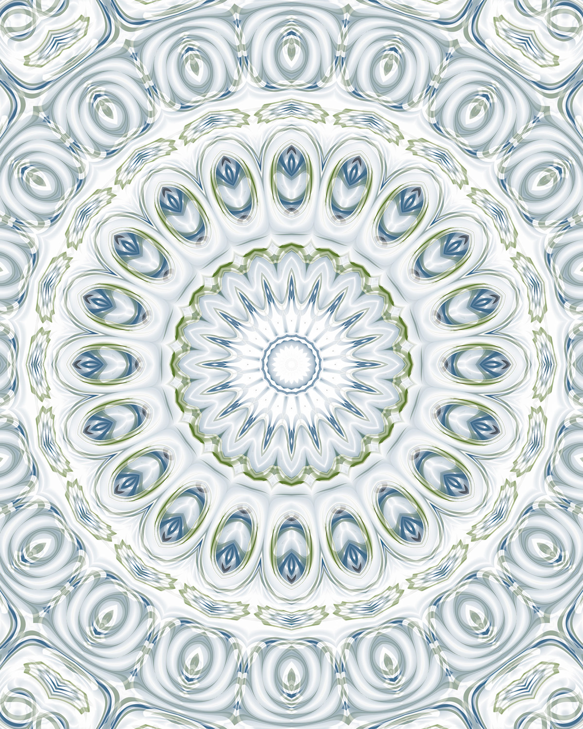
White and pale silver-gray carry this composition with a lightness that feels almost weightless, the soft blue and sage green appearing as accents within the forms rather than as structural colors — glimpsed inside the oval and leaf shapes like something seen through frosted glass.
The central flower is brilliant white at its core, its petals long and narrow, edged in the faintest blue-gray, radiating outward with a clean, unhurried elegance. A thin ring of olive green borders it, the most saturated note in an otherwise pale composition, before giving way to the surrounding ring of large oval forms — each one a small world of layered blue and green detail set within smooth, dimensional white. The outer field continues in the same vein, concentric ovals and gentle scalloped forms repeating in soft gray and white, the whole composition possessing a stillness that feels entirely intentional.


Sharon

The interplay of pale pink, deep magenta, black, and white gives this composition a dramatic range that sets it apart from softer, more tonally unified designs. The center is luminous and delicate — a finely detailed flower mandala in blush and pale gray that radiates outward with quiet precision — but it is framed by a bold ring of black and white chevrons that creates a sharp, graphic boundary between the soft inner zone and the richly colored outer field.
Beyond that dark border, deep magenta and hot pink assert themselves fully — large glossy circular forms with white centers sit among flowing, marbled shapes in the corners, the color at its most saturated here, the contrast between the dark tones and bright pinks giving the outer edges a boldness that the pale center never suggests. The tension between those two registers — the softness within and the intensity without — is what makes this composition so visually engaging.


Star Dust and Peonies

Deep rose and dusty mauve move through this composition in broad, generous sweeps, the white appearing primarily as highlights within the rounded forms rather than as open space — giving the whole surface a rich, full quality with very little breathing room between elements.
Two concentric rings of large pearl-like spheres dominate the mid-zone, their glossy white surfaces catching light against the deep rose surroundings, creating the most distinctive structural feature of the composition. At the center, a deep magenta disc holds a finely detailed flower form whose long, narrow petals radiate outward with precision. The outer field moves away from the circular geometry of the center into something looser and more organic — flowing, interlocked shapes with small, white-highlighted circular forms nestled within them, and small four-pointed star shapes appearing at intervals where the white briefly opens up against the dark rose.


The Antique Tree

Teal and deep forest green weave through this composition alongside a cool silver-gray that gives the forms a metallic, almost verdigris quality — the combination suggesting aged copper or patinated bronze, something that has developed its color slowly over time.
The central mandala glows with the brightest teal in the composition, its finely detailed rings of petal forms luminous against the surrounding dark zone, which creates a strong sense of depth — the center appearing to sit within the surface rather than on top of it. From that dark inner ring, the design expands outward through a richly layered field where the silver-gray and teal alternate in fluid, organic forms that flow into one another without hard edges. The overall surface is dense and immersive, every area occupied, the three tones working together with a cohesion that feels natural rather than constructed.


The Apparition

Pure black and white, with every shade of gray between them — this composition has a high-contrast intensity that no color palette could quite replicate, the forms rendered with a glossy, photographic dimensionality that makes the surface feel lit from within.
The central mandala is crisp and formally structured, its rings of pointed petals and leaf forms sitting in sharp definition against a dark core, the contrast between black and white at its most extreme here. Radiating outward, the forms grow larger and more fluid, the whites luminous and the blacks deep and rich, the continuous interplay between the two creating a surface that seems to shift as the eye moves across it. The outer field is populated with large, rounded forms — many of them containing small eye-like shapes or concentric circles — and the overall composition has a watchful, arresting quality that suits its title perfectly.


The Dreamer’s Window

Soft lavender and dusty purple settle over this composition like a wash, the white background showing through in the outer areas while the center deepens into a richer, more saturated violet. The shift from pale to deeper purple moving inward gives the composition a sense of gathering — the color concentrating itself as it approaches the center.
That center is a luminous, pale star form in blush and white, its fine petals radiating outward with delicate precision before giving way to successive rings of deeper purple leaf and circle forms that build the larger mandala structure. Small mint green accents appear only at the very edges of the composition — four small circles and fine linear details at the corners — so subtle they might be missed at first, but adding just enough of a cool, complementary note to keep the purple from feeling too closed in. The outer field is soft and rounded, the forms loosely arranged in lavender and white with a gentle, flowing quality throughout.
This design is a part of my Dancing Mandala series. Watch on YouTube.


The Early Morning Seashell Hunt

Warm taupe and creamy white are all this composition needs — the palette so spare it feels like bleached driftwood or the interior of a shell, the forms emerging from the white background with the gentlest possible contrast.
The central mandala is the most tonally varied element, its concentric rings moving from warm taupe at the core through successive layers of cream and white, the detail intricate but rendered so softly that it seems to dissolve at its edges into the surrounding brightness. Long, narrow petal forms radiate outward from this center, each one striated in cream and white, luminous and dimensional. The corners hold clusters of large concentric circles in taupe and white — the most structurally defined elements in an otherwise open and airy composition — their rounded forms providing a gentle anchor to the four edges while the vast white center breathes freely between them.


The Power of Dreams

Purple fills this composition wall to wall — not as linework against a contrasting background, but as the background itself, the entire surface saturated in soft violet with deeper purple and muted gray-mauve providing the tonal variation. The effect is immersive and enveloping, like being inside the color rather than looking at it.
The large central mandala floats within this purple field, its edges blending into the surrounding color rather than sitting in sharp definition, the deeper violets of its inner rings gradually softening outward. A ring of small pearl-like spheres encircles the mid-zone, their pale tone the lightest element in an otherwise consistently saturated composition. The outer field is rendered in the same muted violet as the overall background, with flowing organic forms and small leaf shapes that are visible but never insistent — the whole surface unified by color into something that feels continuous and unbroken.


The Wand of the Mage

Turquoise and violet make a striking pair — the cool brightness of the teal pushing against the depth of the purple, neither willing to recede, the tension between them giving the composition a vivid, charged energy. White appears throughout as a third element, outlining forms and opening up space within the dense color.
The central mandala is large and elaborately structured, its many-pointed star built from alternating teal and purple leaf forms that interlock with precision, the whole structure rotating with considerable visual momentum toward a bright teal starburst at the very center. The outer field is equally rich — large concentric circular forms in saturated turquoise fill the mid-zone on all sides, their glossy, layered surfaces rendered with depth and dimension. A border of white-edged scallops and beaded forms runs along the top and bottom edges, framing the composition with a decorative finality that gives it a finished, jewel-box quality.


Velvet Escape

Warm taupe and deep brown-gray cover this composition with a richness that feels thoroughly considered — not the cool neutrality of silver or slate, but something warmer and more enveloping, the palette sitting somewhere between dark chocolate and weathered stone.
A small, precisely drawn circle of white at the very center is the brightest point in the entire composition, a single clear note surrounded by rings of dark rounded forms that build outward in successive layers — deep and dimensional, the tones shifting between warm dark brown and cooler gray as the eye moves through them. The outer field is dense with large oval and eye-shaped forms rendered in the same warm tonal range, their layered outlines giving the surface a continuous, flowing depth. The pale gray appears at intervals as a gentle counterpoint, tracing through the darker forms like light finding its way through a narrow opening.


When Roses Sing

Deep magenta, black, and pale lavender create a composition of real drama — the dark tones dominating the surface while the bright purple and soft lavender flare through them like light through stained glass. The forms have a glossy, dimensional quality, the blacks deep and rich, the magentas vivid where they catch the light.
The central mandala is dark and densely layered, a tightly wound star form in near-black and deep purple with small white petal tips that provide the only real relief from the surrounding darkness. From there the design expands outward through a field of large, fluid organic forms where black and magenta alternate in continuous flowing shapes — the lavender appearing primarily at the edges and in the spaces between the larger forms, its softness providing an unexpected counterpoint to the intensity of everything surrounding it. The overall composition is one of the most dramatically contrasted in the collection, its darkness shot through with color in a way that feels both rich and alive.


Leave a Reply