
Dreamgazer is a series of fifteen designs, each one built from the same essential structure — deep black, a single color, and an intricate symmetrical form radiating outward from a central point. The colors range from warm and earthy to cool and luminous, from softly muted to sharply vivid. Within that consistent framework, no two designs feel quite alike. Some colors push forward against the darkness, others dissolve into it. Some compositions feel precise and architectural, others fluid and organic, their forms suggesting anything from carved stonework to poured liquid. Taken together they form something that functions both as a series and as a collection of individuals — related but distinct, each one worth lingering over.
Amber

This image is a highly detailed, symmetrical abstract composition rendered exclusively in amber gold and deep black. The design radiates outward from a central circular motif — a dense, flower-like form with fine radiating lines at its core — surrounded by successive rings of increasingly complex organic shapes. The overall structure is strongly kaleidoscopic, with perfect bilateral symmetry both horizontally and vertically. The gold forms are fluid and irregular, resembling poured or stretched liquid rather than geometric constructions.
Moving outward from the center, the forms become larger and more elaborate, incorporating looping, curling, and branching shapes that suggest organic or biological references — tendrils, cells, and flowing liquid forms among them. The black background plays an equally active role, with the negative space forming its own distinct shapes between the gold lines. The density of detail is consistent across the entire image, with no areas of rest or simplification.


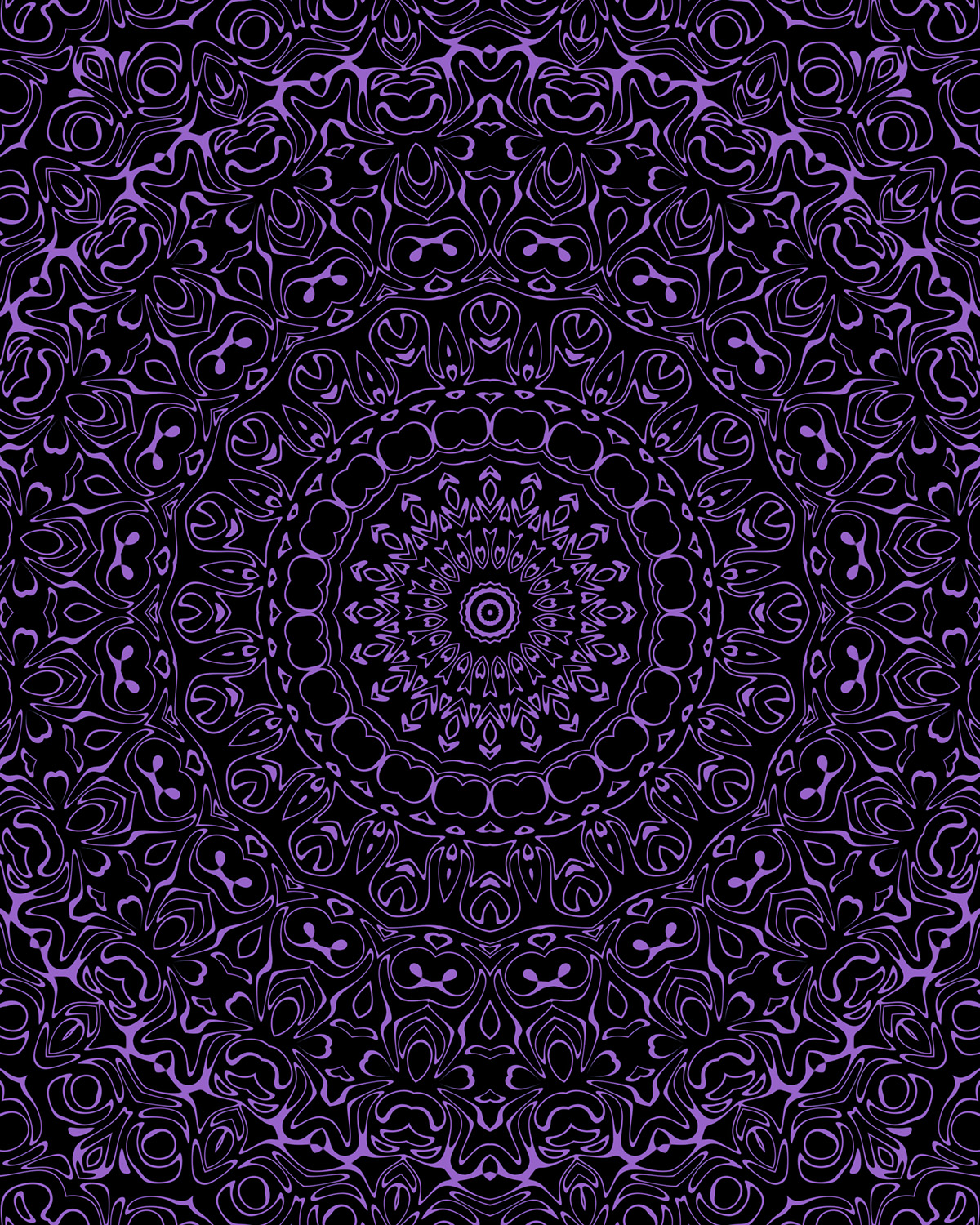
Amethyst

This image is a highly detailed, symmetrical abstract composition rendered in amethyst against a deep black background. It radiates outward from a central circular motif — a mandala-like form with a small concentric circle at its very core, surrounded by rings of pointed, spiky shapes that step outward in increasing complexity. The overall structure is kaleidoscopic with perfect bilateral symmetry both horizontally and vertically.
Moving outward from the center, the forms transition from tightly packed, finely detailed geometric rings into broader, more irregular organic shapes — looping curves, teardrop forms, and branching elements that fill the outer portions of the composition. The black background becomes increasingly dominant toward the edges, with the amethyst forms growing more dispersed. Throughout, the negative black space forms its own distinct shapes between the amethyst lines, playing an equally active role in the overall composition.


Apricot

The central mandala in this design is among the most formally structured and ornate of the series — its core built from concentric rings of precisely shaped petals and pointed forms that recall decorative tile work or carved wood. The apricot lines are fine and consistent, giving the center an almost engraved quality, like something etched into a dark surface rather than drawn on top of it.
Moving outward, that precision gradually loosens into freer, more fluid shapes — sinuous curves, small enclosed loops, and paired rounded forms that repeat across the outer field. The apricot sits warmly against the black, its soft peachy tone creating a gentler contrast than a brighter or cooler color would. The black dominates throughout, with the apricot forms reading more as intricate linework than as filled shapes, giving the overall composition an openness and delicacy despite the density of detail.


Avocado

What strikes you first about this design is how close in value the avocado green and black are — there is relatively little contrast between them, so the eye has to work to pull the forms out of the darkness. The effect is immersive, the details revealing themselves gradually rather than announcing themselves all at once.
The central motif is composed of rounded, eye-like forms arranged in concentric rings — softer and more organic than a sharply geometric mandala, with each ring built from repeating oval and petal shapes that nest together closely. The surrounding field is richly detailed, with broad organic forms filling the mid-ground and edges, leaving very little of the black background exposed. The avocado green occupies generous areas throughout, giving the composition a lush, saturated quality that distinguishes it from designs where the color reads primarily as fine linework against black.


Azure

The vivid azure against deep black creates a sharp, electric contrast — the blue seems almost to radiate off the dark ground. Where other colors might recede or blend into the darkness, this particular shade of blue holds its ground with intensity, the filled areas glowing and the fine linework crackling with clarity against the black.
The center is delicate and precise — a ring of fine radiating lines surrounded by small, carefully shaped petal and teardrop forms that feel almost miniature given the scale of what surrounds them. From there the design expands outward through a broad dark zone before erupting into the richly detailed outer field, creating a distinct sense of depth — as though the central motif sits at the bottom of something rather than on top of it. The outer areas are filled with rounded, eye-shaped forms and flowing connected shapes where the azure fills broad areas between fine black outlines, the color and the dark ground trading dominance back and forth across the surface.


Baby Blue

The soft, airy quality of baby blue brings an unexpected delicacy to the composition — light enough that it reads almost like fine silverwork against the deep black background, cool and quiet rather than bold or insistent. Where a more saturated color might assert itself forcefully against the darkness, baby blue holds back, the contrast gentle and the overall effect more subdued than the color’s brightness might suggest.
The central motif sits within a large, predominantly black star-shaped form that creates a dramatic void at the heart of the composition. A small ringed circle at the very center builds outward through successive layers of pointed petals and leaf forms, the baby blue appearing primarily as fine outlines in this middle zone. Toward the edges, rounded flower-like shapes with distinctive keyhole centers repeat across the surface, the linework becoming looser and more fluid.


Blue

Deep blue against black is a combination that lives at the edge of visibility — the two colors so close in darkness that the design emerges almost like something seen at night, the forms revealing themselves slowly as the eye adjusts. The blue reads more as a deep indigo in the shadowed areas, brightening only slightly where the lines are most concentrated.
The central mandala is relatively compact and sits within a broad expanse of dark negative space that gives it a sense of floating isolation. The flower-like center is built from densely layered petals radiating outward with quiet precision. The surrounding field is rendered almost entirely in fine linework — looping, curling, and interlocking forms where the black dominates and the blue traces their outlines rather than filling them. This keeps the overall composition feeling open and airy despite the inherent darkness of the palette.


Brown

The rich, burnt brown against black has the quality of aged bronze or dark wood grain — warm and deep, with a natural earthiness that sets it apart. The two tones are close enough in value that the composition has a unified, almost monolithic presence from a distance, the detail revealing itself only as the eye moves closer.
The central mandala is notably dark — a dense, tightly wound core where the black dominates and the brown appears primarily as fine outlining, creating a sense of depth that draws the eye inward. Radiating outward, the forms open up and the brown becomes more generous, filling broader areas with sweeping, fluid shapes and branching curves. The outer edges are particularly animated, with bold organic forms that give the perimeter of the composition an expressive, flowing energy.


Burgundy

Burgundy and black are a pairing of considerable depth and gravity — the deep red sitting heavily against the black, the two colors merging at the edges of forms in a way that makes the composition feel almost three-dimensional, as though the surface has been carved rather than drawn.
At the center, a large circular void of pure black commands attention — a dark hollow around which the design orbits rather than radiates from. The ring surrounding this void is built from small, tightly packed rounded forms that create a beaded, jewel-like border. From there the composition expands outward through successive layers of increasingly complex shapes — rounded forms with small circular centers repeat throughout the mid and outer areas with remarkable consistency, giving the overall design a strong rhythmic regularity that distinguishes it from more freely flowing arrangements.


Byzantium

Byzantium — a deep, wine-tinged purple — sits close to the black in tone, and the result is a composition of considerable mystery and shadow. The color never fully asserts itself, instead emerging from the darkness in a way that feels gradual and layered, the forms discernible but never stark.
The central motif is spare at its core — a small, quietly detailed circle surrounded by a large expanse of near-black that creates a contemplative stillness at the heart of the design. A pointed star-like form frames this dark center before the composition opens into the surrounding field, where the linework becomes increasingly animated. Paired circular forms — two small dots sitting side by side — recur throughout the outer areas with notable frequency, lending the design a distinctive rhythmic signature that the eye begins to recognize and follow as it moves across the surface.


Camel

Camel brings a dry, sandy warmth to the black background — neither as bright as gold nor as muted as brown, it occupies a middle tone that gives the composition an almost antique quality, like something seen on aged parchment or weathered stone.
What distinguishes this design structurally is the way the camel forms a broad, continuous mid-zone that encircles the central mandala like a wide halo — the color fills generous connected areas here rather than appearing as isolated shapes or pure linework, creating a dense ring of warm tone that dominates the center of the composition. The central mandala itself is fine and intricate, a sharp starburst at its core surrounded by carefully detailed rings. The outer edges pull back toward finer linework against black, so the eye is drawn inward toward that luminous middle band where the camel is most concentrated and the detail most richly layered.


Cerulean

The large, elaborately scalloped central mandala dominates this composition in a way that feels almost architectural — its concentric rings of leaf shapes, beaded borders, and fine radiating detail forming a structure so resolved and complete that it reads almost as an object unto itself. The cerulean fills broad areas within and around it, creating a luminous central zone that gradually gives way to the darker, more linear outer field.
There, large rounded forms populated with paired circular dots repeat across the surface with quiet insistence, the black reclaiming more territory as the eye moves toward the edges. The cerulean is clear and cool throughout — neither warm nor aggressive — and that quality suits the precision of the design, the color and the intricate geometry reinforcing each other across the full surface of the composition.


Chartreuse

Chartreuse against black is striking and a little uncanny — that particular yellow-green has an almost fluorescent intensity that makes the forms seem to vibrate slightly, the color so visually assertive that the eye has difficulty settling anywhere for long.
The outer field is where this design is most distinctive — rounded forms with paired dot centers crowd together in tight, repeating clusters that cover the surface with remarkable uniformity, the chartreuse and black dividing the space in nearly equal measure. This evenness across the outer areas makes the central circle feel like a deliberate clearing — a more formally structured mandala of petal and leaf forms set within a filled chartreuse disc that sits calmly at the center of all that surrounding activity. The four corners pull back to sparser, sharper shapes, small star-like forms punctuating the edges where the density briefly relents.


Chocolate

This is a dark composition — the chocolate brown so deep against the black that the two barely separate in the shadowed areas, the forms emerging and receding as the eye adjusts. The center is surprisingly modest given the scale of everything around it — a small, precisely drawn sun-like circle with a toothed outer ring and a concentric core, sitting alone in a wide expanse of near-black that gives it an almost lonely presence.
The real density of this design lives in its outer ring — a broad band of richly detailed forms that frames the dark center like a wreath, the chocolate filling generous connected areas here before the corners pull back into finer, more open linework. The overall structure feels less like something radiating outward and more like something encircling, the weight of the composition gathered at the periphery rather than the center.


Cobalt

There is a strong gravitational pull to this composition — the eye drawn steadily inward through successive rings of forms that grow progressively smaller and more refined as they approach the center, like looking down into something deep. The cobalt blue fills broad, generously connected areas throughout, giving the design a substantial, saturated presence that keeps the black from dominating despite the darkness of the palette.
The forms themselves are notably fluid and curvilinear — sweeping arcs, looping scrolls, and wave-like shapes that give the composition an almost liquid quality, as though the design were caught mid-motion. This feeling is consistent from the outermost edges all the way to the small, tightly wound central circle, where those same flowing impulses are compressed into a precise, jewel-like focal point. The overall effect is one of contained movement — energy held in careful balance across the full surface.


Leave a Reply